https://nasacademy.com/blog/article/how-to-draw-realistic-pictures

Have you ever wanted to learn how to draw pictures that look like photographs? Do you want to learn how to draw realistic sketches that pop off the page?
Well, we’re here to tell you that you can!
No matter who you are, you can learn to draw. All it takes is patience and dedication.
While there really is no right way to “do art,” realism is its own style. And just like any other style, it has certain rules that can make all the difference between an image that looks somewhat real, and one that looks very real.
Here are some ways you can learn to draw more realistically, and bring your simple drawings to life on paper:
Now “filling your toolbox” doesn’t mean you have to go and grab all of the top-of-the-line art tools. But, having a few different materials can really help when it comes to making your drawings look more realistic.
If you’ve been drawing with just a simple writing pencil, it may be time to invest in a couple of tools to really help you learn to draw with realism.
A huge part of realism is detail. And achieving detail means having a variety of pencils, erasers, and other tools to help you get the look you’re going for.
Here are some tools you could try to help with realistic drawing:
These are pieces of paper that are wrapped up into tight stumps that come to a point at the end. These help with blending and smudging when you’re shading your subject. And if you want to blend small details, there’s a smaller version you can get called “tortillons” that can really help you get great results.
These erasers are almost like a ball of clay. You can mold them into whatever shape you want to help you erase small details that a normal eraser can’t.
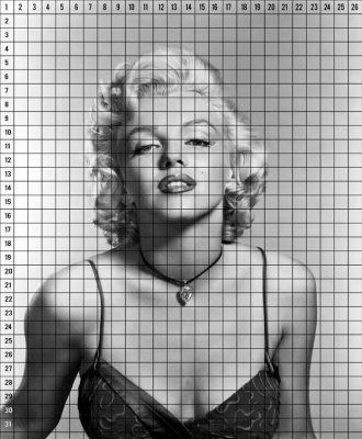
Grids can significantly help with proportions if you’re just starting out with realism. You can either buy grids or draw your own!
This tool looks like a pair of scissors, but can help when measuring different elements of your drawings to make sure your proportions are right on your page.
(You can also check out our recent post on drawing tips to learn more about different pencils and other tools you can start with.)
There are plenty of physical tools out there that you can use to help you draw realistically, but it’s really all about practice, technique, and finding what works for you. So don’t be afraid to experiment – and don’t rely on tools to get you the best results.
It’s common for beginners to draw by starting one section, shading it, finishing it, and then moving onto the next part.
But if you find yourself ending up with weird-looking animals or portraits that have lopsided eyes or heads that are way too big for the bodies, this process of mapping out your composition might help make your drawings look more real:
1. Take the whole picture and sketch it out on your paper.
2. Make sure the pencil strokes are gentle and light. Avoid sketching with dark shading or dark lines right away or else you’ll have a hard time erasing it, especially when you need to change something. It’ll also end up making your paper look messy and worn out.
3. Take a hard lead pencil (H pencils), keep a light grip on it and map out where everything is going to go across the page.
This method is sure to help you get used to proportions especially while learning how to draw realistic portraits. It’ll also make sure you’re on the right track before you commit.
You can also do a grid across the page to help you get the proportions right:
Even afterwards, if you’re finding something a bit off, another great tip is to hold up your sketch in front of a mirror.
The mirror is a great tool that will highlight any mistakes and disproportioned elements you may have missed. Doing this right at the composition stage can also save you a lot of time.
It will be way easier for you to adjust and get the right proportions before you fully commit to shading and coloring it in.
An important part of becoming an artist, especially when you want to learn how to draw with more realism, is to know how light works.
Light helps us see things clearly. So when the light changes, it changes how everything looks.
You must understand how light behaves, learn how it casts shadows and lights up subjects based on its direction and intensity. All of this is necessary when learning how to draw your pictures with as much realism as possible.
So, how do you learn how light behaves? You practice!
Take your image and pick which direction your light source is coming from. You can even do a test image by drawing some fruit or a simple 3D shape on a table.
For this example, we’ll put the the light source in the top left.
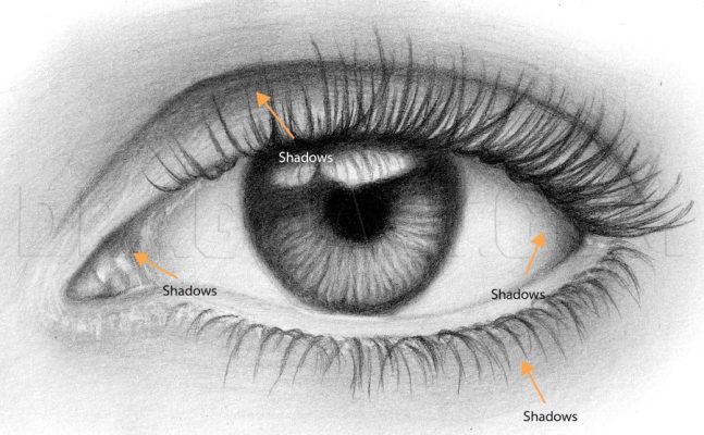
When you have light on a subject that is on or against another surface, it is illuminated by both direct light and reflected light. That’s why when you see a photo like the one below, it’s not a complete dark shadow on the other side, there are darker sections and lighter sections of the shadow.
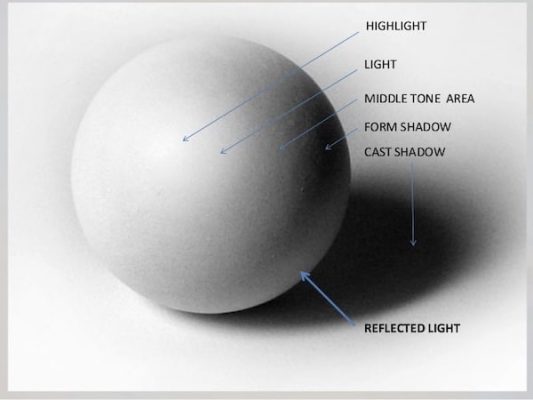 You can see the variation in the form shadow, and how its level of darkness or value doesn’t actually cover the whole backside of the ball like you might assume.
There’s reflected light right underneath the ball from the surface it’s sitting on. This makes the form shadow stand out as darker, and highlights the even darker section right under the ball in the cast shadow, where there is no light hitting it.
This variation in values is what helps create that 3D effect.
On the light side, you’ll see the highlight, the light, and the middle tone area.
The highlight is the brightest part of your image. It is actually a direct reflection of the light source, and it will change depending on where you are standing when looking at the subject.
The light and middle tone areas are also a part of the direct light, but are slightly darker than the highlight. They deepen as they get closer to the core shadow, giving the sphere that rounded effect.
So, on your image, figure out the depth of the light – is it more behind the object, in line with it, or a bit ahead of it?
This is going to help determine where your shadows lie, and where the highlight is on the subject. In this example, based on the highlight and the direction the cast shadow is stretching, you can tell the light is coming from the left side, a bit in front of the ball.
But the best way to really create realistic images, and truly understand how shadows and highlights behave, is to test it out in real life.
Take a light of your own and physically move it around a subject of your choice to see how it changes. Observing is a large part of being able to recreate realistic images as it helps you define these different shadows and mid-tones.
And once you do, it’s equally important to make sure the transition between each side is accurate to the type of lighting as your subject – to make it as realistic as possible.
The key to making smooth transitions is blending out your darks and your lights to create a range of mid-tones.
Mid-tones act as a way to transition between the darkest parts of the painting and the lightest parts of the painting. It’s like the different levels of grey in a black and white photograph.
It’s what gives your image form a 3D effect.
 Without mid-tones, you would just have solid black white image which won’t look realistic. Varying up the tones in your work is what’s going to help round out your subjects and lift them from the page.
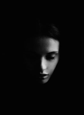
Even if it’s a harsh light like the photo below, you can still see there’s a slight transition that softens the edges between the darkness and the skin. It might seem almost invisible, but it’s there.
Creating good transitions between tones comes from good shading techniques.
Once you understand the light, you can start to shade easier.
Even if you have a reference image telling you where the obvious shadows are, understanding and noticing differences in value will help you recognize the more subtle ones. And those are the most important.
When you’re learning to shade, proper pressure control on your pencil and being able to smoothly shade your subject are necessary.
A great place to start is to practice watching the type of results created from different pressures on your pencil.
Try drawing a value scale with your pencil like this one:
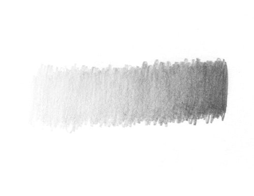
To create lighter shades, try holding the pencil lightly, more in line with the paper and near the base with your pointer finger on top.
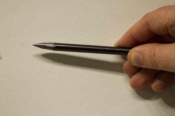
For shading large sections and making large, consistent strokes, you can hold it even closer to the base, and bend at the elbow as you draw rather than using your wrist. As you go, apply more pressure to the pencil to get darker strokes.
If you’re looking to learn to draw one consistent shade, practice just sketching at one constant pressure, and get used to the feeling. That way, when you need a solid-looking shadow, you don’t apply mixed pressure and get a mix of dark and light.
When shading, dull pencils actually work the best. These will help you achieve softer, thicker strokes while reducing the amount of gaps in between.
All of this takes nothing but practice.
You can use whatever pencil you have on hand to practice, and start out in order to learn these important steps first. The tools won’t be as helpful if the technique isn’t there.
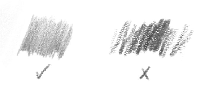
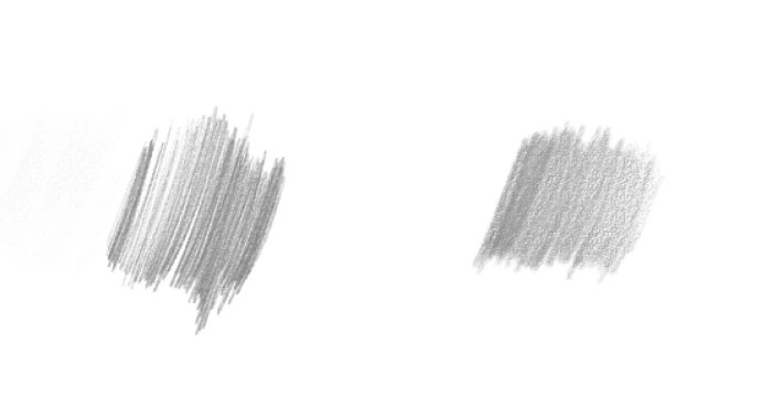
You can use many other techniques when it comes to shading – but blending or smudging out your strokes is going to give you the most realistic results.
Once you’ve got your shaded area, you can achieve this blended effect in many different ways. You can use blending stumps, tortillons, tissues, or even Q-tips. But avoid using your fingers as this can transfer oils on your page and make for a messy shading job.
When you’re blending with a blending stump or tortillon, make sure the end is clean to prevent transferring dark graphite to the lighter sections of your image. This breaks the illusion of realism and makes it look messy.
Try using rounded strokes and equal pressure as you blend instead of scratching back and forth. This way, you don’t get uneven strokes, but you’ll get a smooth, blended shadow.
The fine details and textures in images are what can truly add realism to your drawings.
Focusing on texture can also help you naturally find shading and mold your image into a 3D piece. When you focus on the small sections and the little details, you’ll notice the shifts in darkness and value as you go along.
While drawing things like hair on portraits, it’s easy to get frustrated with all of the individual strands and to rush through it instead. But just scribbling back and forth is going to take away the realistic element of your picture.
A great technique to work on hair is to divide it into sections, rather than just doing it all at once. Switch between your pencils, add strokes of darkness and highlights to create form and direction.
Adding the simple textures and details like flyaways on someone’s hair, the pores on their face, and moles on their skin can really help turn simple drawings into lifelike pieces.
A great hack to keep in mind when you’re using a reference image, is to change it to black and white. This way, you can easily see the shifts and tones between shadows and highlights, and it will help make the textures stand out.
Part of learning how to draw realistically, is learning when not to draw.
When we outline things harshly, especially on natural images like faces, it makes it look fake. This is because there are no harsh, straight lines in nature.
Try layering the shading to create shadows and then blending it in instead of doing it as one harsh outline.
In the image below, you can see the difference between the eye that’s outlined, and the eye that’s shaded. And you can really see it in sections like the waterline. The waterline on the left doesn’t even look like it’s there. It’s just drawn as a line directly against the eyeball. Meanwhile, in the image on the right, the waterline of the eye is there.
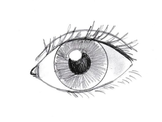
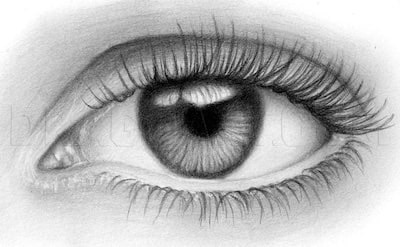
The only difference is that it’s not drawn…it’s shaded.
The shadows are allowing the white of the paper behind it to be a highlight, and it’s lifting the waterline from the page
You might think that some things like the whites of the eye don’t have shadows, but really, they do. If you look closely at the eye image again, you can see a slight mid-tone where the eyelids meet the eye. This gives it that same 3D effect as the ball.
Just like we talked about in shading, there are mid-tones, a highlight, and shadows that gives your image a 3D effect. Creating those mid-tones and finding those slight shifts in tone from the eyelids is what is going to give the eye a rounded appearance rather than flat one.
So even when you think something doesn’t have shading or shadows, it does. Just look closer.
Adding these subtle details will help give your work that three-dimensional, realistic look to it
You can get very realistic images that still look flat when the variation between the values is too similar. Take a look at the images below:
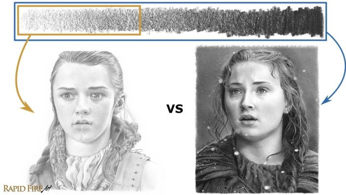
Even though the drawing on the left is well done and looks pretty realistic, it doesn’t have the same realism and photographic-quality as the one on the right.
That’s because the image on the right has a wider range of value.
The darks are very dark and the lights are light. Practicing the shading exercise and getting different pencils from lightest to darkest can help give you the range you need to make your image pop. And remember, you can have a wide range of values and still have your drawing look less realistic, if you don’t properly shade with smooth blending and transitions.
Learning how to draw with realism isn’t easy. It takes patience, detail, and a great deal of time to understand all the techniques needed to bring your simple drawing to life on the page.
Even professionals will take several hours for one realistic portrait drawing.
So, study your subjects. Study lights.
Do actual tests with real objects and real light sources.
You can watch and learn from other creators who document their drawing techniques and processes on YouTube, and use them as inspiration.
Sometimes the best way to learn is to look up to those around us who have been exactly where we are and know what it’s like. And that goes for any kind of content you are hoping to create – realistic drawings or not.
Learn more about how to draw realistic images

By Team Nas Academy

By Admin Nas Academy
WE EMPOWER CREATORS.


